As you early readers of my blog know, I had a design “contest” using 99Designs for a new logo. I’ll have another post on how the economics of 99Designs lead to some less desirable results.
This post however, is about how selection of the logo happened.
Setting context: The brief I gave
Title: “Create a clearly personal, yet elegant logo and FB header” by Wouter.org.
The tone I want to convey is me (Wouter, my first name, masculine) talking to you (the reader), one on one, person to person, not with a lot of attention on me but also not shrinking that it is me you are talking to. I’d love the logo to be very similar to my own handwritten Wouter, or quite different but inspired. The total domain name “Wouter.org” has to be quickly understandable, with .org clearly part of it.
I’ve also attached some pictures of me for possible inspiration on the header files. All are mine in terms of copyright and can be used for this.
Lessons learned
Cross cultural experiences
An important practical detail for me was that the total domain name “Wouter.org” would be immediately clear. This brought up interesting multi-cultural perspectives. As the logo was based on my (arguably not so readable) handwriting, I found out that the t is crossed differently in the US for example. I did not know that cursive writing varied that much!
Voting isn’t that distinctive
I set out a poll with friends to ask for feedback.
It turned out that the actual voting itself wasn’t as useful to me as I expected, as the voting results were pretty close to each other:
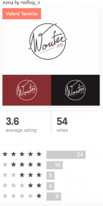
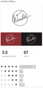
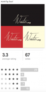
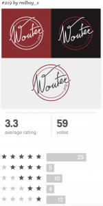
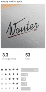
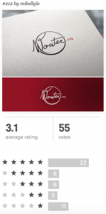
Interestingly there was quite a bit of “love or hate”, i.e. designs having lots of votes in both the “1: hate it” and the “5: love it”. My conclusion: this design does stir things with the viewer. 😉
Text remarks are most actionable
Getting specific comments from people turned out to be the most useful. I could spot common themes in what worked and did not work for people, and those who had experience in graphic design gave detailed feedback.
However, quite often that feedback was completely contradicting the previous feedback in impressively new ways. The first feedback would say some aspect of the logo was very unclear, the other immediately saw me and my name in it, the third said it wasn’t me and the ‘t’ should be different.
In the end I, Wouter, make the decision
So, with conflicting signals, ultimately this was my decision to make and hold. Not much different from my technical work and other leadership positions 😉
So I decided for the one that felt the most authentically me.
It looks really good on shirts and a business card!
With gratitude (and a new logo),
Wouter